Splatink font
NOTE: This font is for PERSONAL USE ONLY!
To purchase a commercial license, visit:
https://www.mansgreback.com/product/splatink
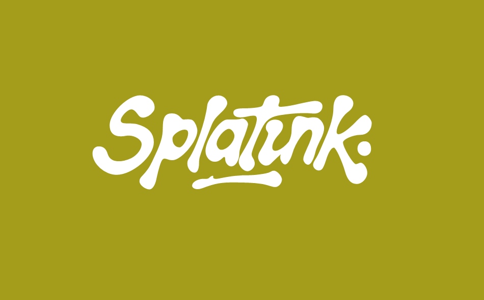
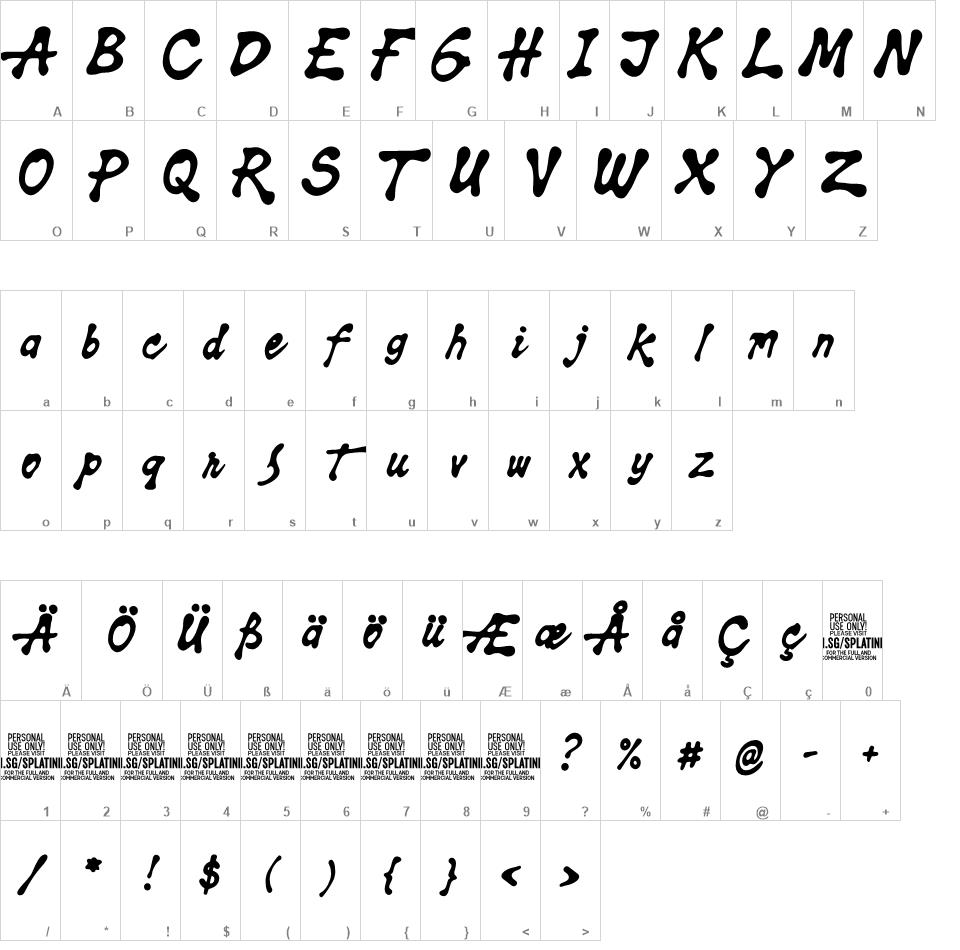
Splatink is an inky handwritten typeface shaped by drops, splats, and slow drips of ink rather than clean strokes. The letters feel heavy with ink, as if drawn when the nib was fully loaded and the ink had a mind of its own. Forms swell where ink gathers, thin out where it runs dry, and occasionally bulge or sag with gravity.
For questions, please visit
https://mansgreback.com/faq 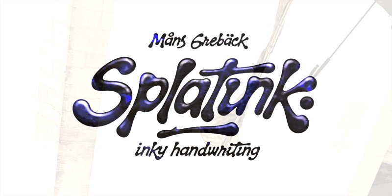

| Font Name | Date | File Size |
|---|
| Splatink_PERSONAL_USE_ONLY.otf | 2026-01-11 | 178 KB |
| img/ | 2026-01-20 | 0 B |
| img/splatink_poster01.png | 2026-01-15 | 276 KB |
| img/splatink_poster02.png | 2026-01-20 | 576 KB |
| img/splatink_poster03.png | 2026-01-20 | 479 KB |
| img/splatink_poster04.png | 2026-01-20 | 336 KB |
| img/splatink_poster05.png | 2026-01-20 | 525 KB |
| img/splatink_poster06.png | 2026-01-20 | 463 KB |
| READ_BEFORE_ANY_USE.txt | 2026-01-15 | 1 KB |
Font Details
By installing or using this font you agree to the Product Usage Agreement:
https://www.mansgreback.com/pua
-----------------------
This font is for PERSONAL USE ONLY and requires a license for commercial use.
The font license can be purchased at:
https://www.mansgreback.com/product/splatink
Please read "What license do I need?" for more info:
https://www.mansgreback.com/license
-----------------------
Splatink is an inky handwritten typeface shaped by drops, splats, and slow drips of ink rather than clean strokes.
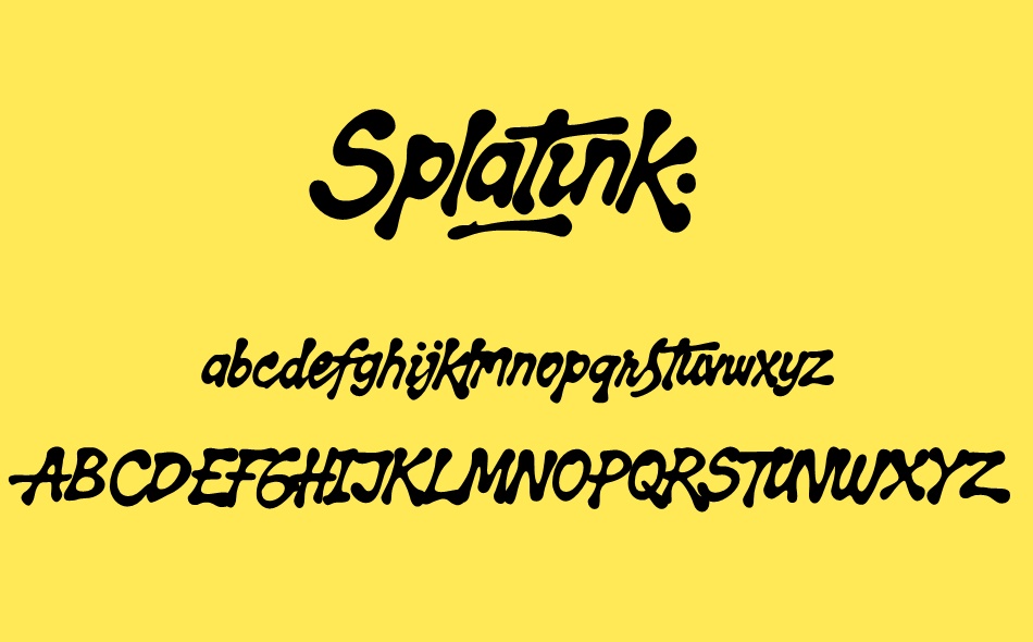
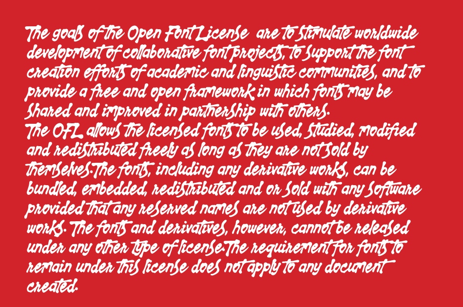
The letters feel heavy with ink, as if drawn when the nib was fully loaded and the ink had a mind of its own. Forms swell where ink gathers, thin out where it runs dry, and occasionally bulge or sag with gravity. Small splats, soft edges, and uneven contours give the text a wet, tactile presence, like ink that hasn’t fully settled yet. It stays readable, but never tidy, carrying a natural messiness that feels organic and alive. Light, Regular, and Bold allow the ink to range from subtle pooling to deeper, more saturated shapes.
I wanted the lettering to feel fluid and imperfect, guided by ink rather than precision. Splatink embraces drips, weight shifts, and irregular flow, letting the letters appear formed by motion and chance instead of strict control.
The font is built with advanced OpenType functionality and guaranteed top-notch quality, containing stylistic and contextual alternates, ligatures and more automatic and manual features; all to give you full control and customizability.
It has extensive lingual support, covering all Latin-based languages, from North Europa to South Africa, from America to South-East Asia. It contains all characters and symbols you'll ever need, including all punctuation and numbers.
-----------------------
For further information, please read the FAQ:
https://www.mansgreback.com/faq
Splatink font download, Splatink font.